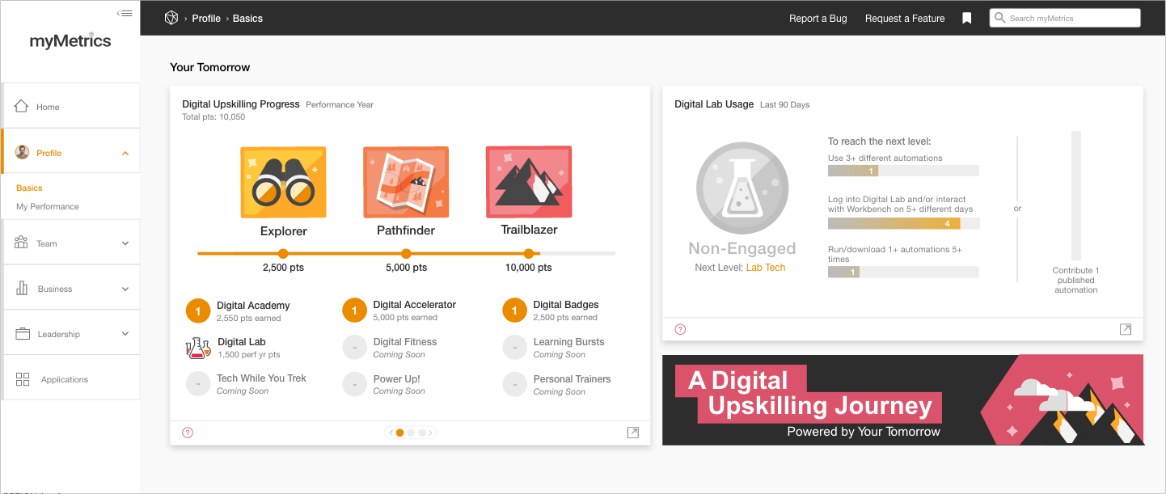
Understanding the Challenge
When I began this project, I got a lot of information from the stakeholders. They had already conducted user research sessions, and they had a problem statement in mind. They were looking for me to create a feature that would allow users to monitor progress through the Your Tomorrow digital upskilling program within myMetrics. The stakeholders also put together a mockup of their own, which they provided me with to illustrate their ideas. The problem statement looked something like this:
We need a way for users to monitor their progress through the Your Tomorrow upskilling program in the myMetrics application.
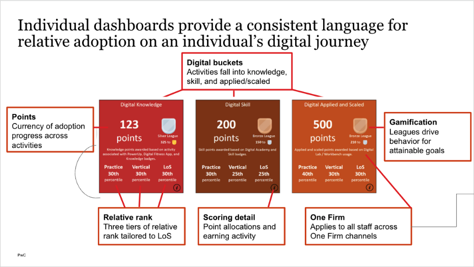
Defining the Solution and Crafting the Experience
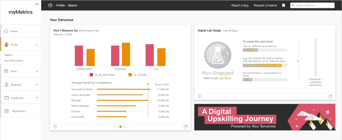
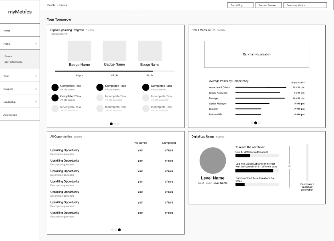
I spent a lot of time in the defining phase trying to figure out how best to work with the data visualizations for this project. I needed to capture a points score, a level name, relative rankings, instructions for getting to the next level, and more. I ended up having to write out all of the user stories I was trying to capture so that I could see all of the specifications in one place:
I can see my percentile vs. the average percentile of my staff class within my Competency (so, vs. my staff class, I'm in the 85th percentile, for example, meaning that I have a higher number of points than 85% of the people in my staff class). And, if that's the case, that bar should be 85% high (assuming the container it's in is 100% height.)
I can see my percentile vs. the average percentile of ALL staff in my Competency (so, vs. all staff, I'm in the 75th percentile, for example, meaning that I have a higher number of points than 75% of the staff in my Competency). If that's the case, that bar should be 75% high (assuming the container it's in is 100% height).
I can see my percentile vs. the average percentile of my staff class in my Vertical, and I can see my percentile vs. the average percentile of ALL staff in my Vertical.
I can see my percentile vs. the average percentile of my staff class in my line of service, and I can see my percentile vs. the average percentile of ALL staff in my line of service.
Solution
After iterating on the user experience, data visualizations, point counts, empty states, graphic badges, and more, I handed off a design solution to our development team that the stakeholders were extremely happy with. The dashboard went live within the myMetrics application and was available for use to all 55,000+ PwC employees across the United States and Mexico.