The Problem
PwC, one of the Big Four accounting firms, holds a dominant position in its industry with a net worth of $55.4 billion. However, due to mergers, acquisitions, and other strategic moves, the organization has become fragmented, leading to overlapping data sources, antiquated reporting tools, and more. Internally, employees lack a single source of truth for account performance metrics, leading to confusion and inefficiencies, and this is especially true for the leadership team, which is responsible for overseeing large, global accounts that make up 80% of PwC's revenue.
Understanding the Challenge and Defining the Solution
During the discovery phase of this project, we conducted Voice of the Customer sessions and 1:1 interviews with 50+ participants including PwC Partners, Client Strategists, and leadership support staff. We identified a need for these users to have detailed data tailored for their largest accounts all in one place. We dug into what data was most important to them, how they wanted to use it, and how we could serve it to them in a way that was easy to understand and navigate. We also created personas and user journeys to understand the current state of the user experience and how we could improve it.
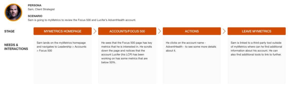
Once we were able to understand the challenges of the project and pain points for our users, we were able to map out new user journeys, set success metrics, and begin designing possible solutions.
Testing & Iteration
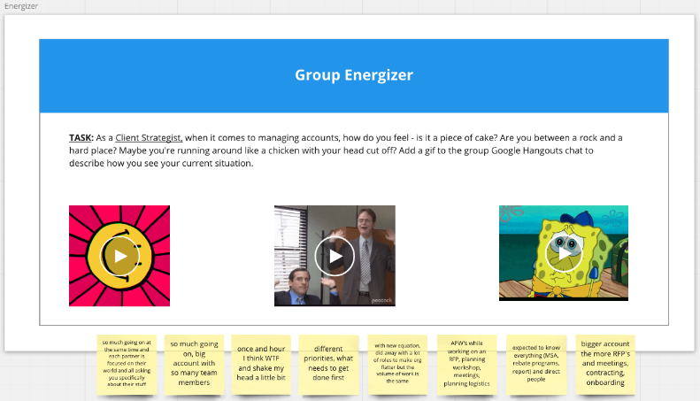
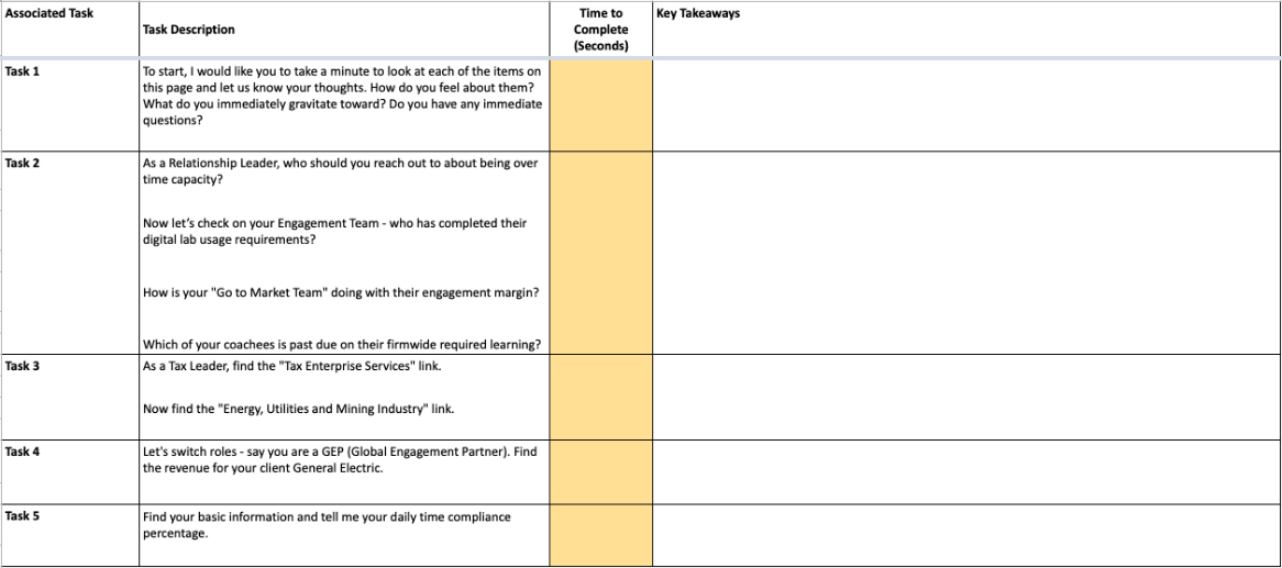
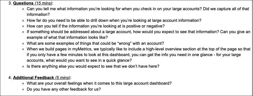
We took our designs back to our users for feedback and iterated based on their feedback. To do this, we scheduled 30-min, 1:1 usability testing sessions with our original users and asked them to complete a short scavenger hunt through the dashboard. We did not help them; we just observed and took notes. At the end of the session, we asked open-ended questions to understand what was helpful and what was confusing.
Results & Impact
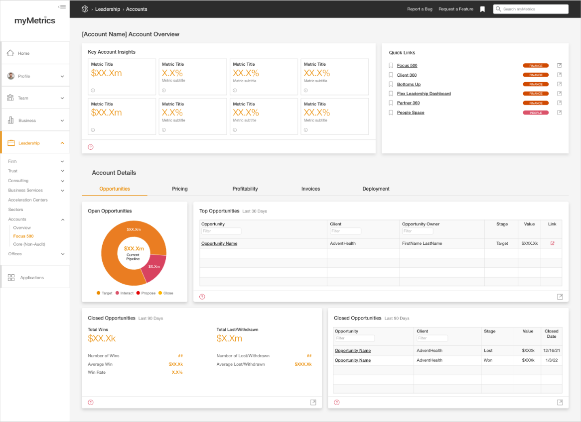
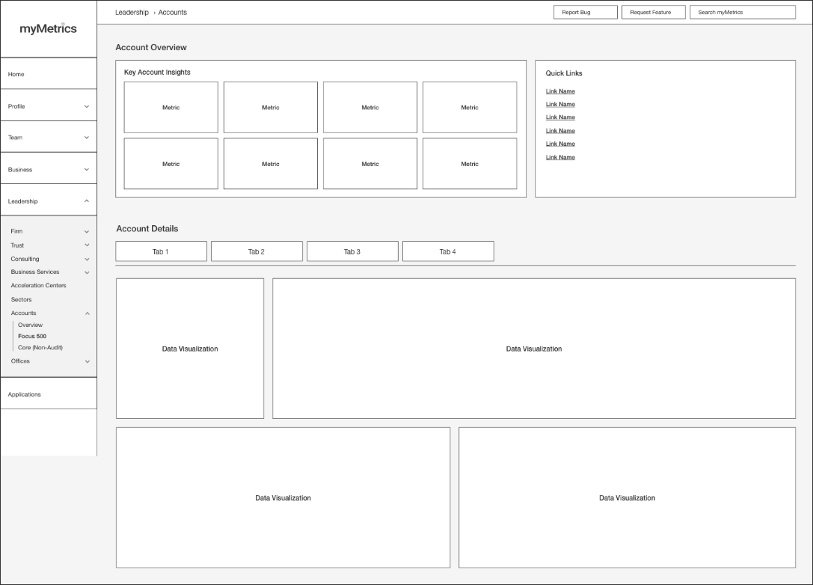
Ultimately, we were able to create a dashboard that provided a comprehensive view of an account's performance, allowing PwC Partners and their support staff to make informed decisions and drive strategic company initiatives. We were able to capture key metrics and KPIs for each account and provide a single source of truth for all account data.